The idea
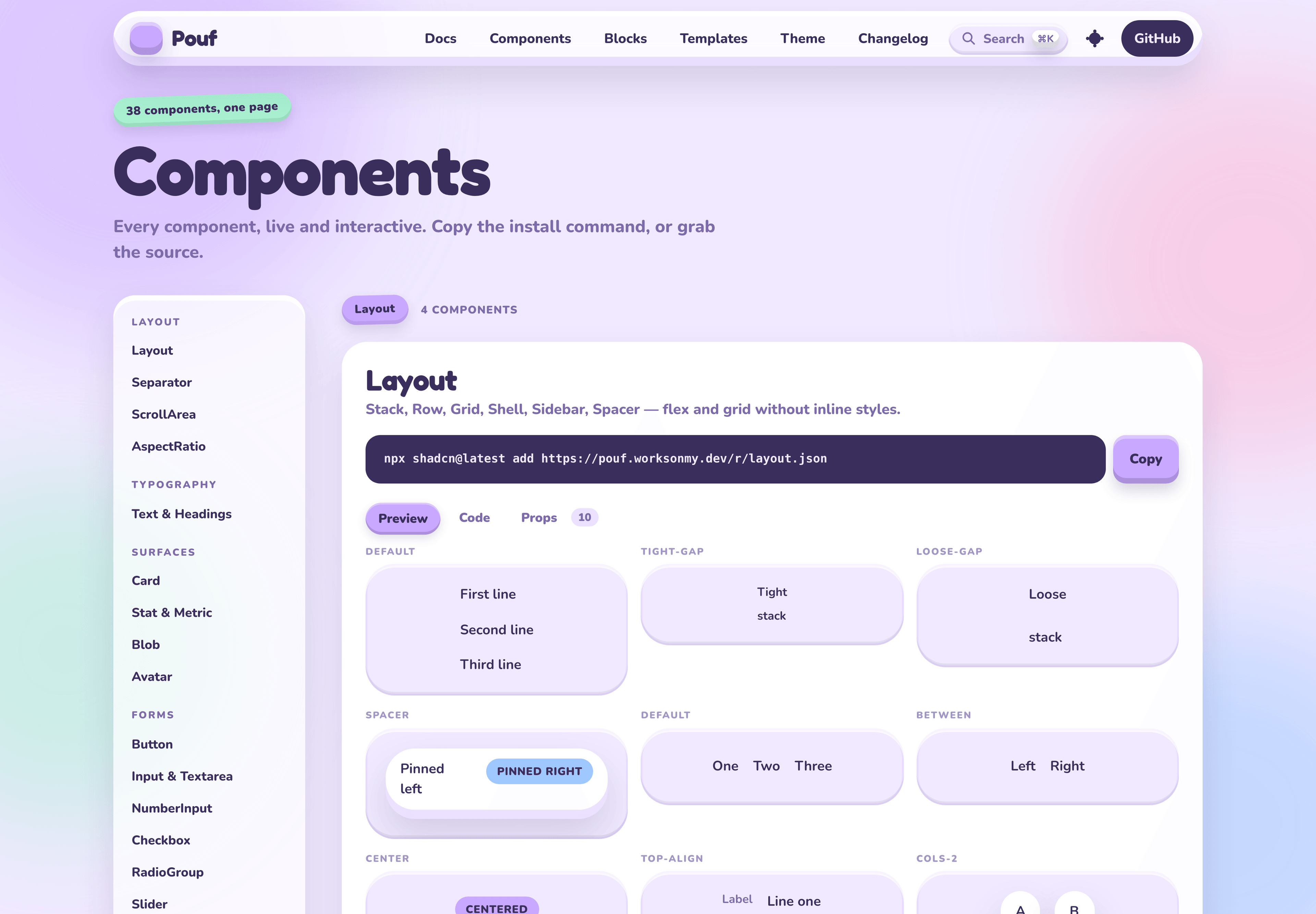
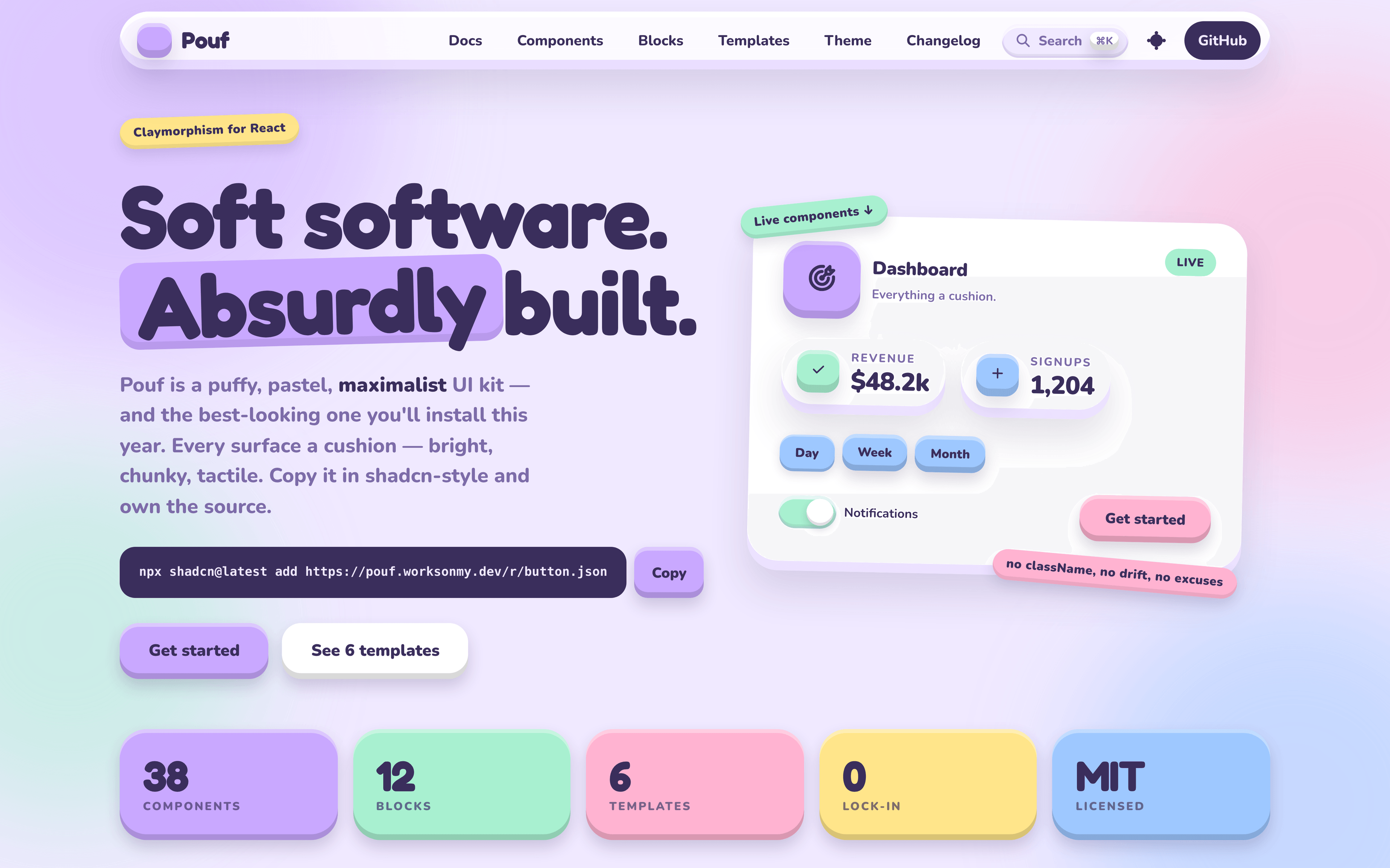
Every surface a cushion. Big radius. Inner highlight. Inner floor shadow. Outer drop. Pastel everywhere.
Pouf is claymorphism taken seriously as a component system rather than a single CSS trick — a full React UI kit where the puffiness is systematic, not applied per-component.
Principles
- Depth is the affordance. Buttons press in; badges stay flat. State you can feel, not just read.
- You own the source. Install with the shadcn CLI or copy the file. No runtime dependency to version-lock.
- Variants, not classNames. Appearance is chosen by props, so your app can't drift off-system. Need an escape hatch? You have the code.
Install
Pouf needs a React app with Tailwind CSS v4 and the shadcn CLI configured.
# the theme (tokens, cushion utilities, keyframes)
npx shadcn@latest add https://pouf.worksonmy.dev/r/base.json

# a component (pulls in its dependencies + the base)
npx shadcn@latest add https://pouf.worksonmy.dev/r/button.json
import { Button } from './components/pouf/Button'

export function Example() {
  return <Button tone="mint">Save</Button>
}
How it's built
A Bun monorepo split into three workspaces: registry (the components
themselves), gallery (a live browser plus a visual gate harness), and www
(the site at pouf.worksonmy.dev). Built on Tailwind CSS v4, Radix UI,
class-variance-authority, and Recharts.
The gallery isn't just a showcase — it carries a golden-file gate and a responsive audit, so a change that quietly breaks a component's appearance fails rather than ships.